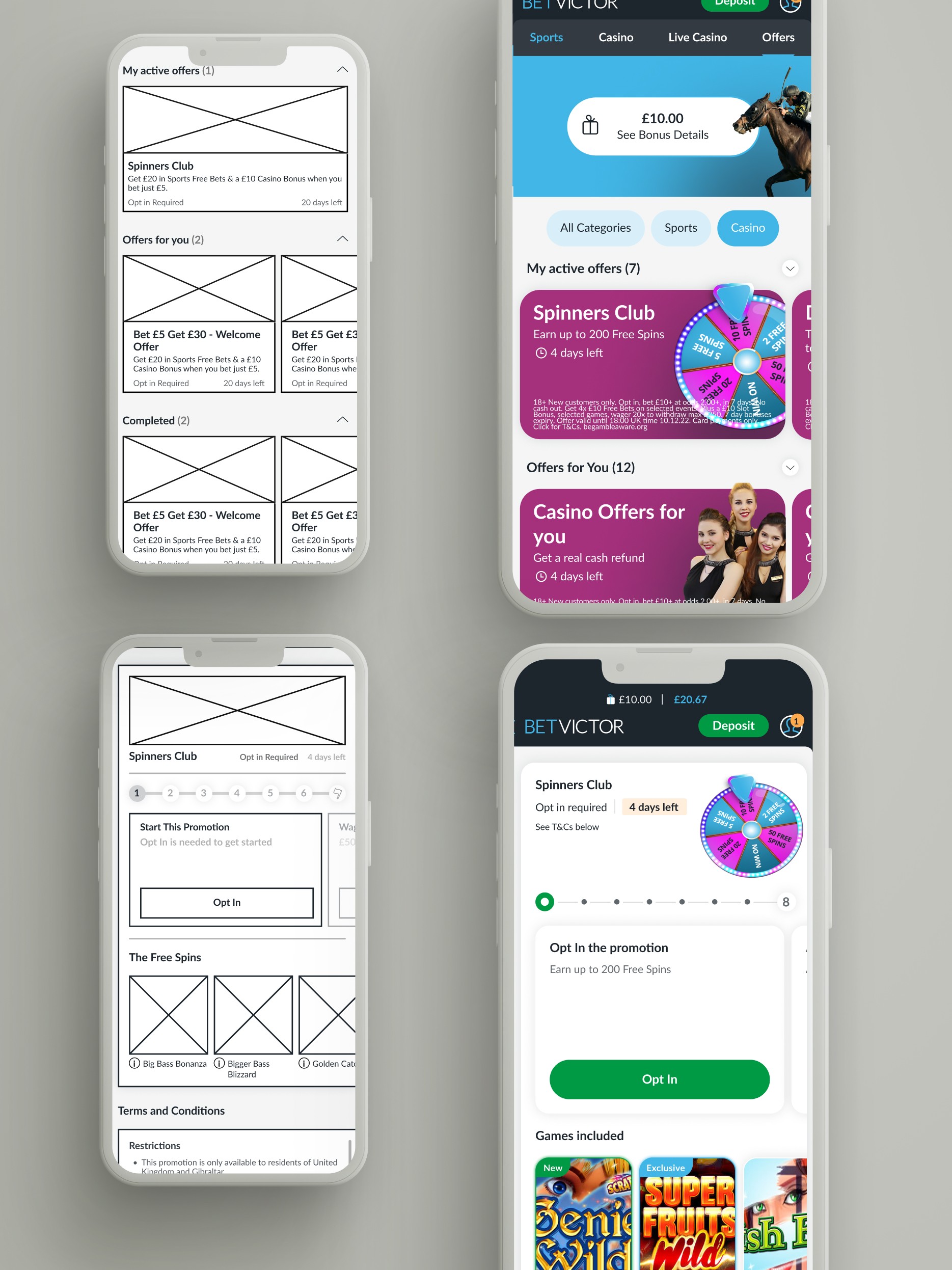
Offers Page
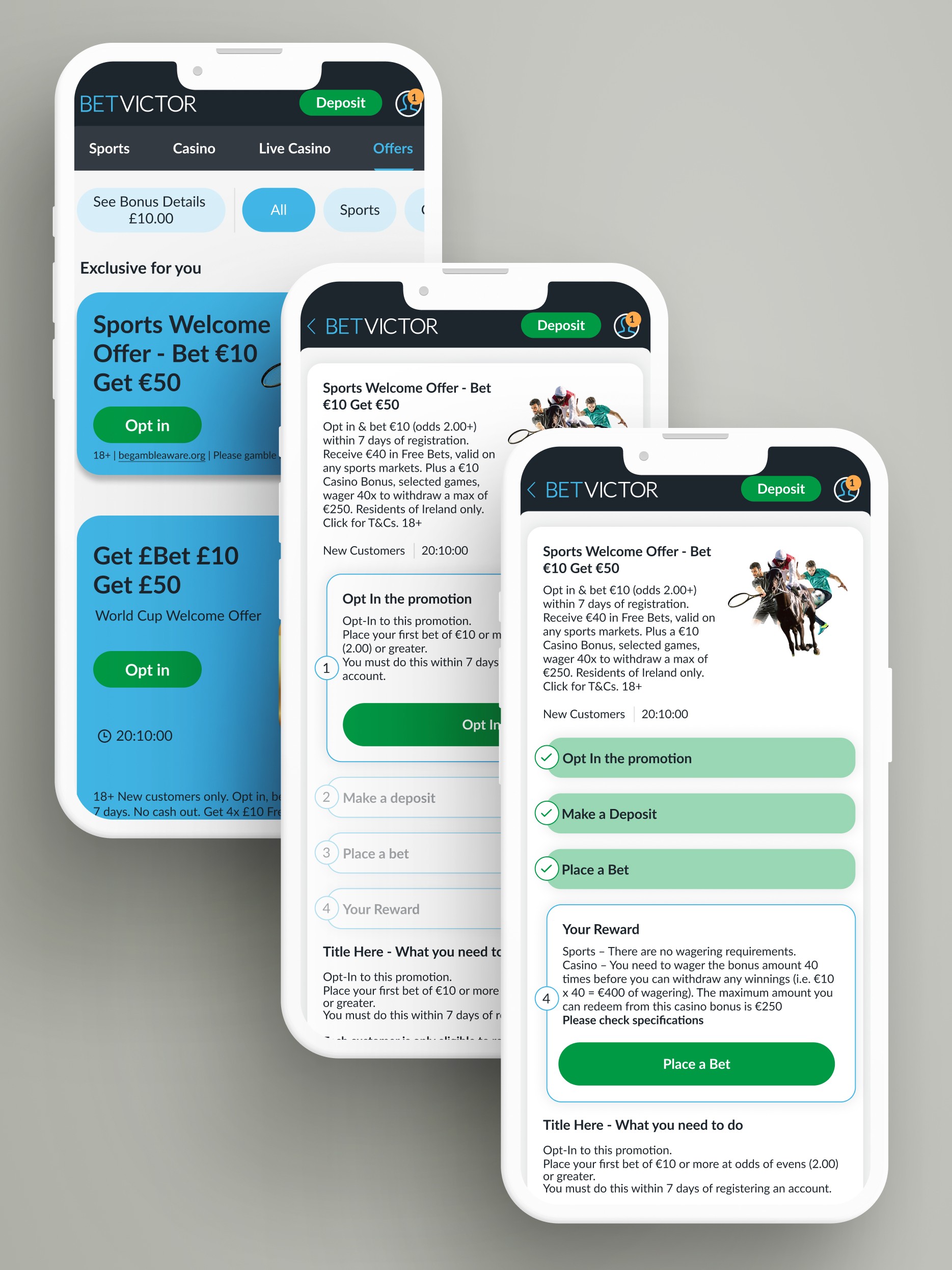
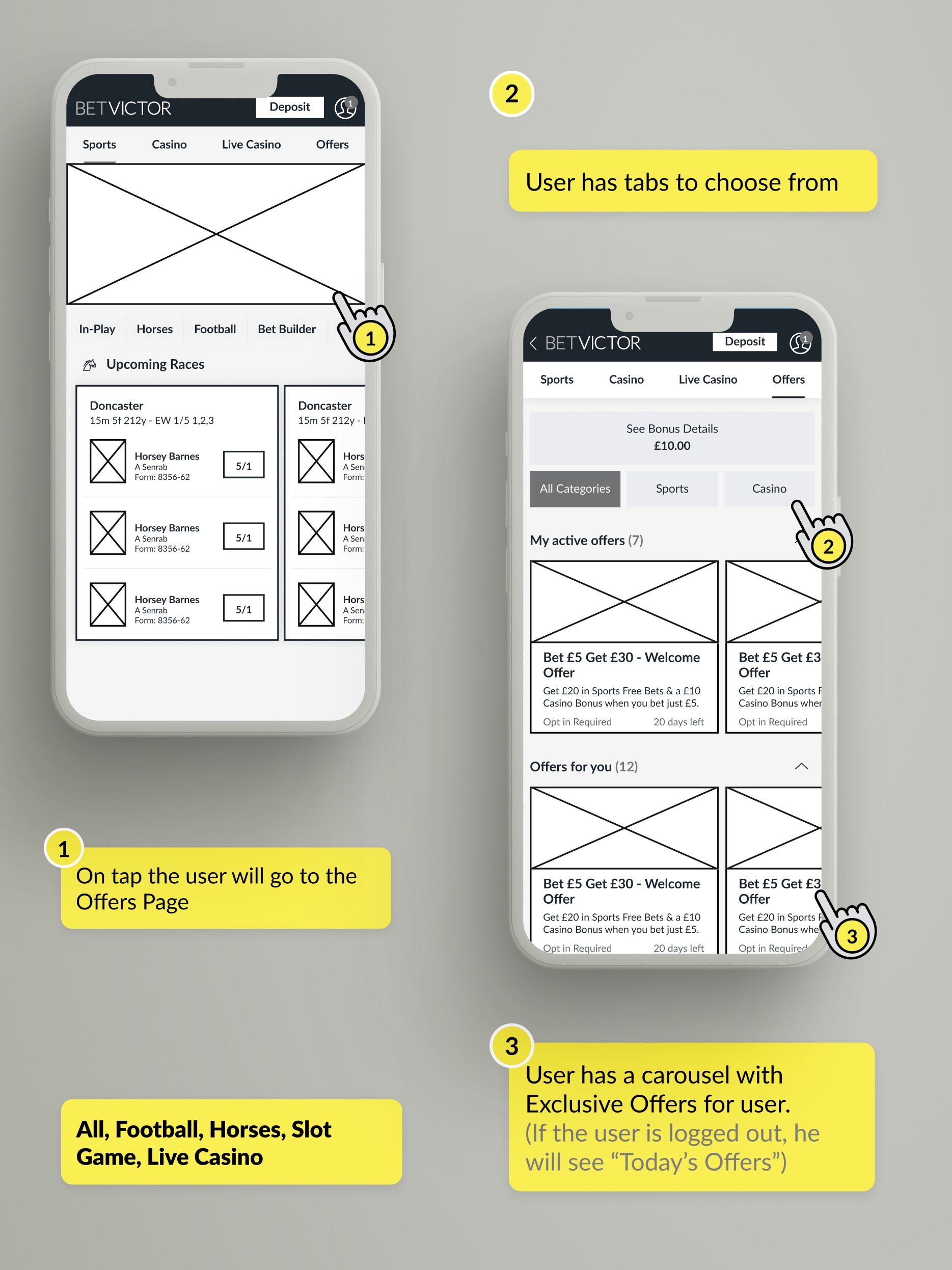
Offers page is an important area of the product. Stakeholders and Product Owners were concerned about the look and feel of the UI. We wanted to show the user a new, vibrant area of our product.
BetVictor Asia
BetVictor Asia
Role
Asia Market (Betting)
What I did
UX/UI Strategy
Timeline
2 months
The background:
We had some concerns about how well this area was functioning. Some features weren't working properly, and the user experience wasn't clear.
The Challenge:
My biggest challenge was coordinating with other departments to create an innovative, interactive card that fit our company's creative guidelines. I had to ensure we had the resources and deadlines to finish and launch it.
Through this project, I learned a lot, especially about the importance of communication and avoiding misunderstandings. As a result, we've started a new process involving all departments.
I had some freedom to propose and create different guidelines for this area, so I really enjoyed redesigning the UI.
How I started the process:
❍ Research
I started by diving deep into researching this area. With my background in advertising, I've always been fascinated by marketing, offers, and promotions.
❍❍ Meetings and Workshops
For almost a month, I worked closely with a Product Owner on this project. Over a 4-week sprint, I led various meetings and workshops to ensure our design matched the business goals. We aimed for results that met our expectations.
❍❍❍ Wireframes and Prototyping
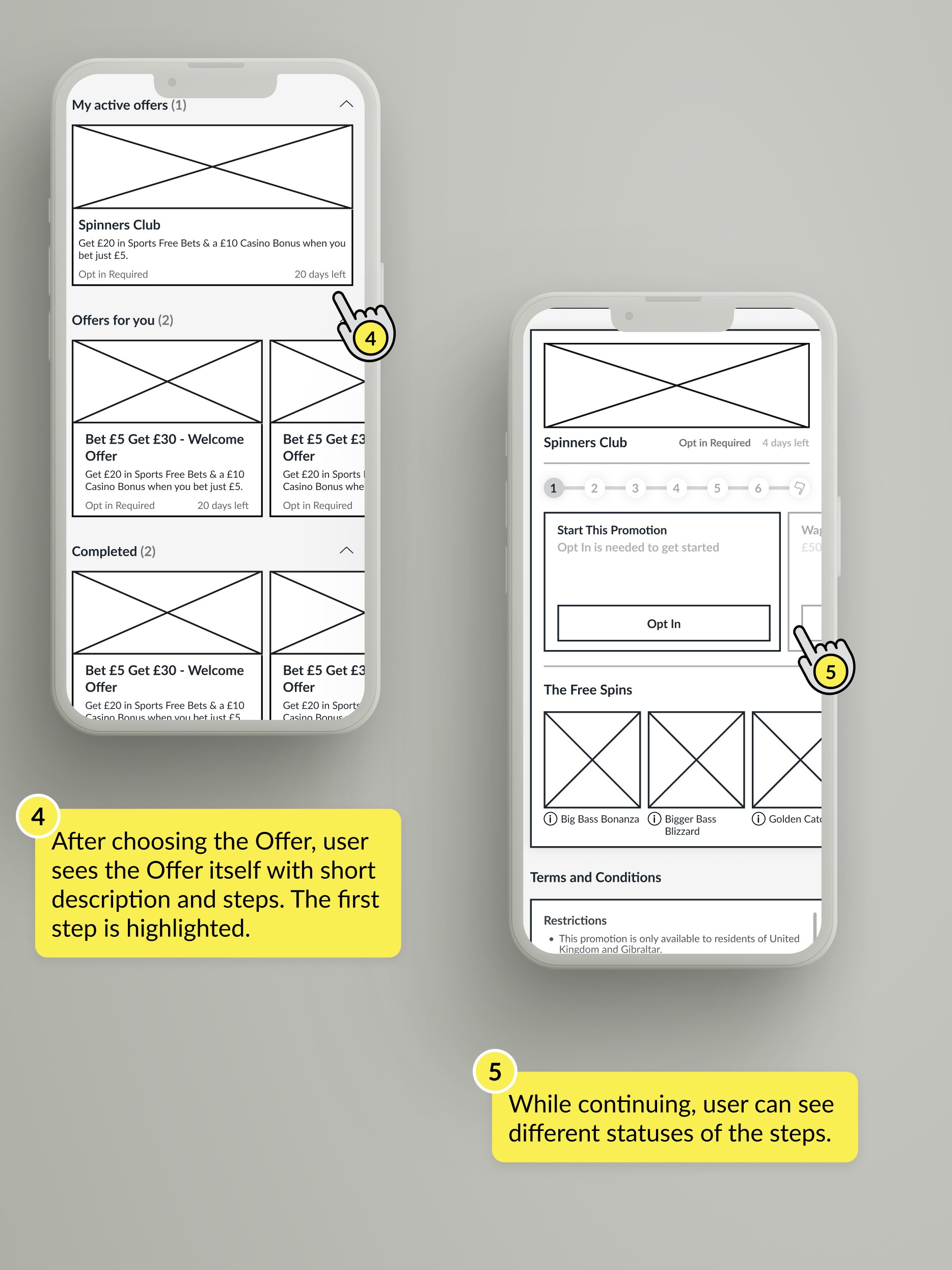
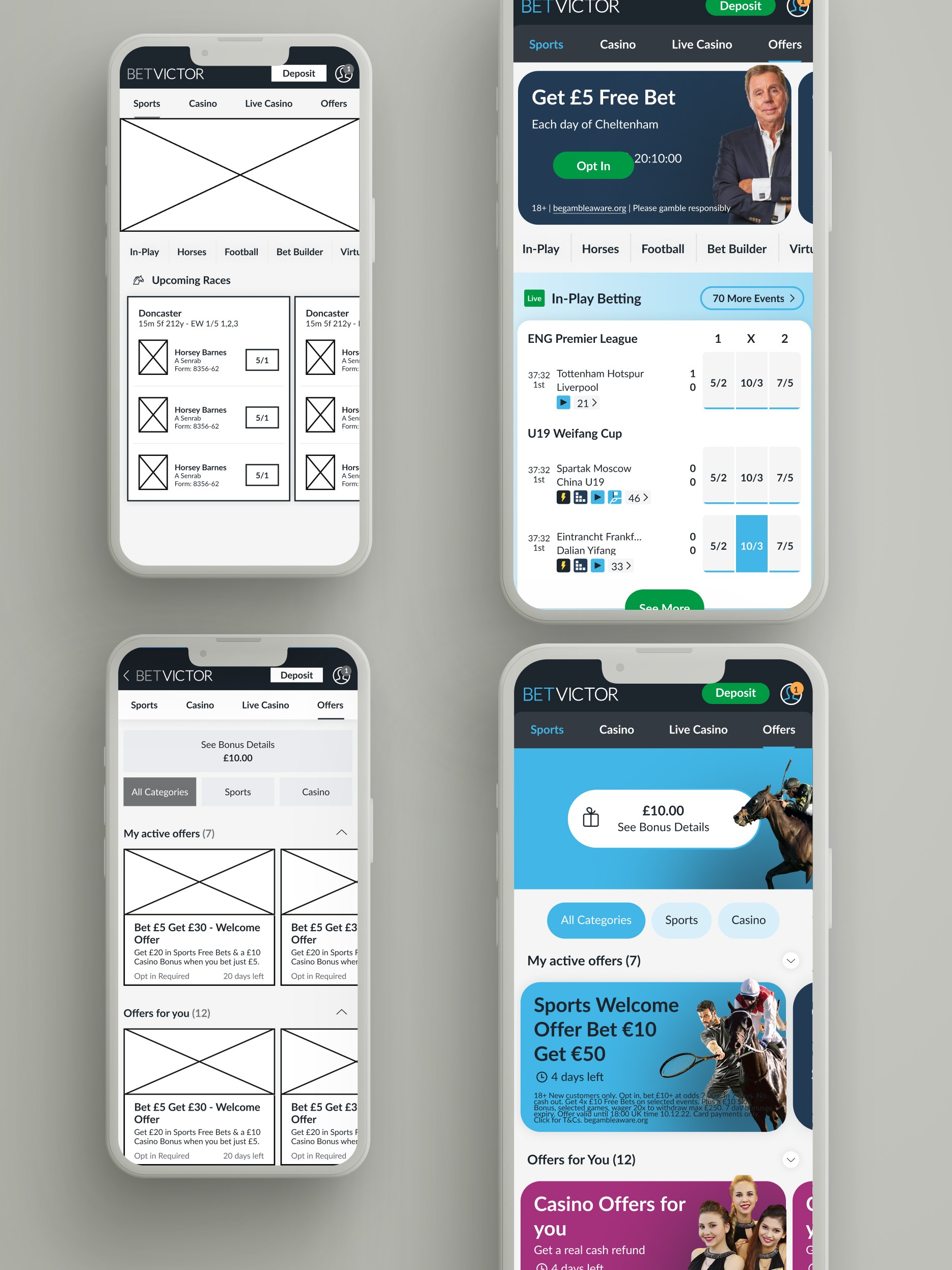
With a clear understanding of the task at hand, I created the initial designs to help users navigate the offers section more effectively. We conducted A/B testing to determine the final version.
❍❍❍❍❍ Results
Marketing, Product Owners, Compliance, and my department joined forces to redesign and create a better, more engaging experience. The result? This area became stunning!
Conclusion
We encountered a few hiccups with multiple versions and some delays, but we were ultimately pleased with the results.
Looking back a few months later, I learned the importance of refining settings and communication upfront to avoid misunderstandings.
Overall, this experience taught me a lot. I appreciated the creative freedom to propose different approaches. Plus, our teams enjoyed the interactive workshops and meetings, which made collaboration more engaging.
The cool things 😎 and the bad things 🥹:
In my case studies, I enjoy sharing what I learned, what worked well, and what could have been better."
Offers is a product area where many teams make decisions. Marketing had one business vision, customer service had another, and my role was to create a balance that worked for everyone. It sounds simple, but once again, communication was key.
This project was particularly enriching because I had the freedom to lead it. However, one major challenge was the constantly changing briefs and requirements, which made our sprints less effective. My small "win" (lol) was aligning development, business, and marketing, improving the product area, and driving a 3% increase in results within the first month.
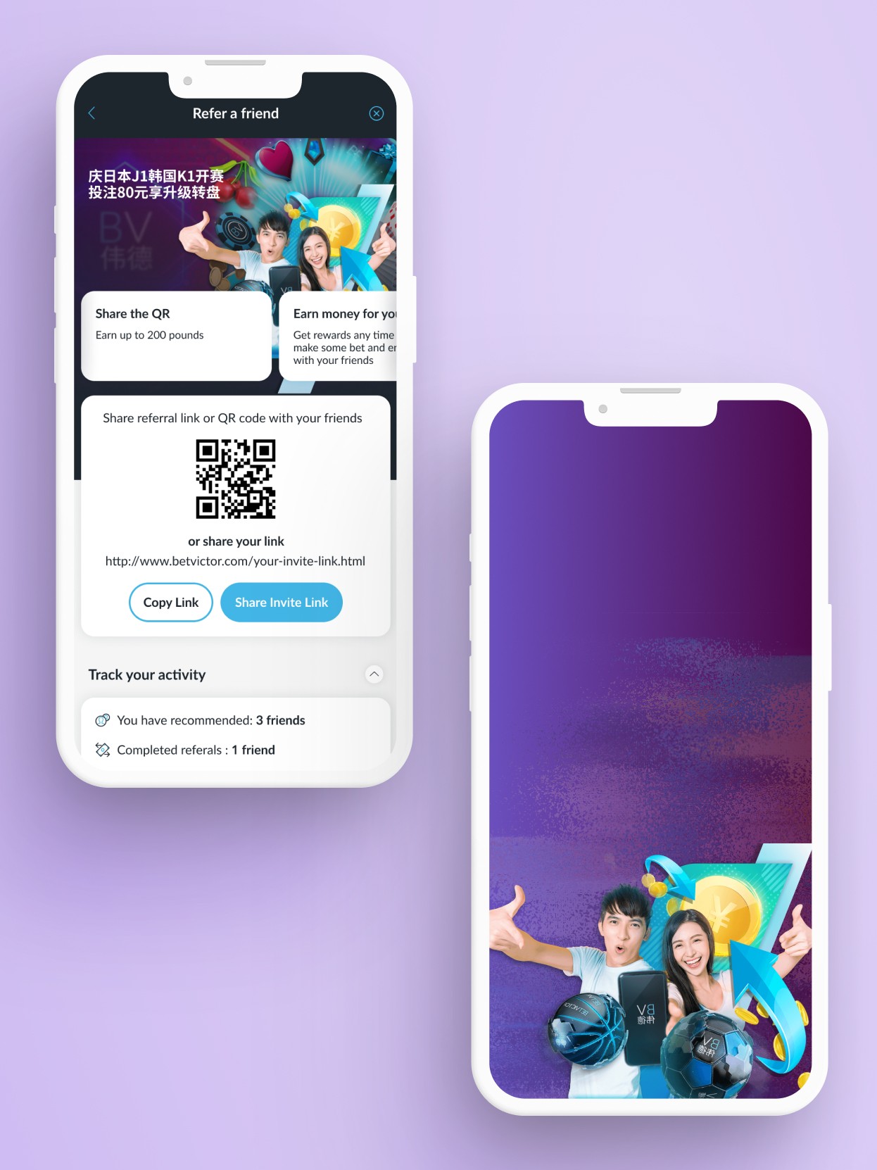
Refer a friend, an offer project to proof the power of sharing and friends
