Asia Cashier
Some struggles and pain points for the user, after a whole cultural Research, focus on conversion.
BetVictor Asia
BetVictor Asia
Role
UX/UI and Research
What I did
Strategy and Data
Timeline
2 months
Reset Password in the Asian market significantly impacts our business goals, ROI, and conversion rates.
Despite its importance, however, our journey has encountered hurdles, ultimately causing lower-than-expected compensation and financial losses.
What I did
UX Research Strategy ・UX Research ・Quantum Metric and Data Analysis ・User Flow・Workshops and Leading Meetings ・ Wireframes ・ Prototyping ・Mirroring
The main area of the product had some struggles
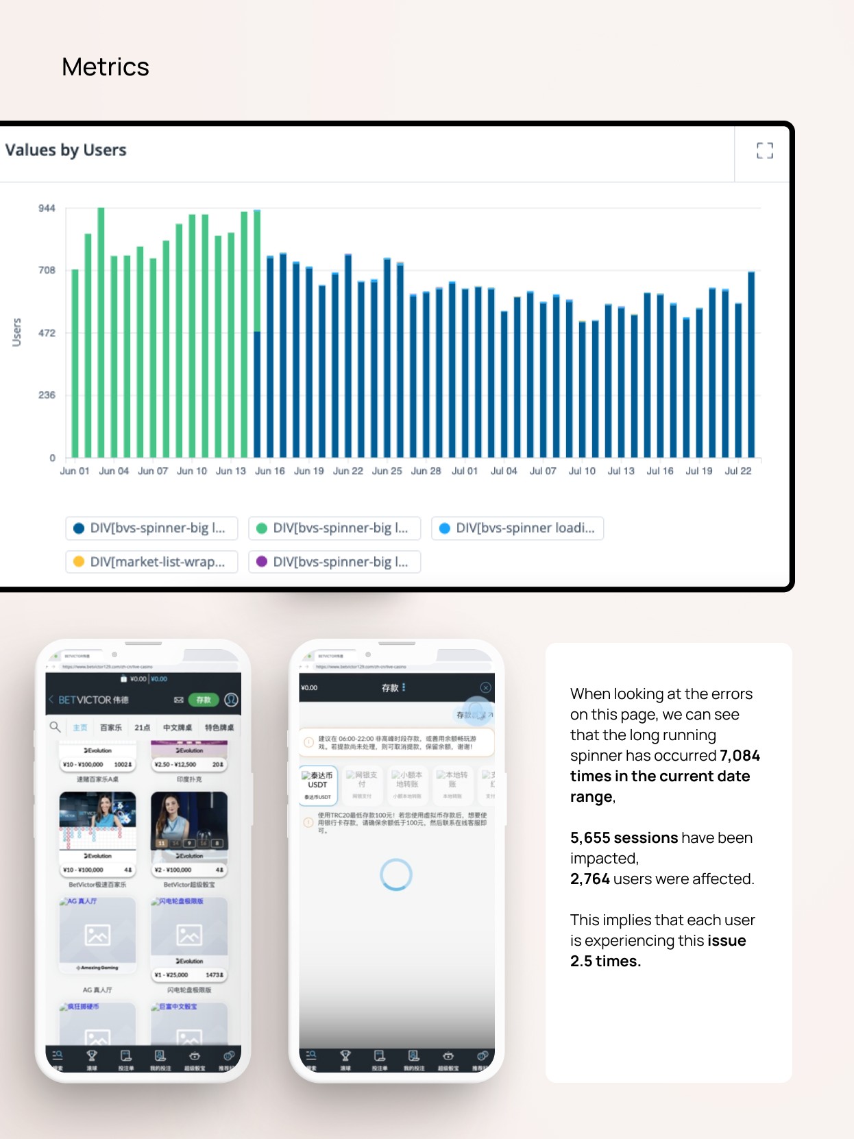
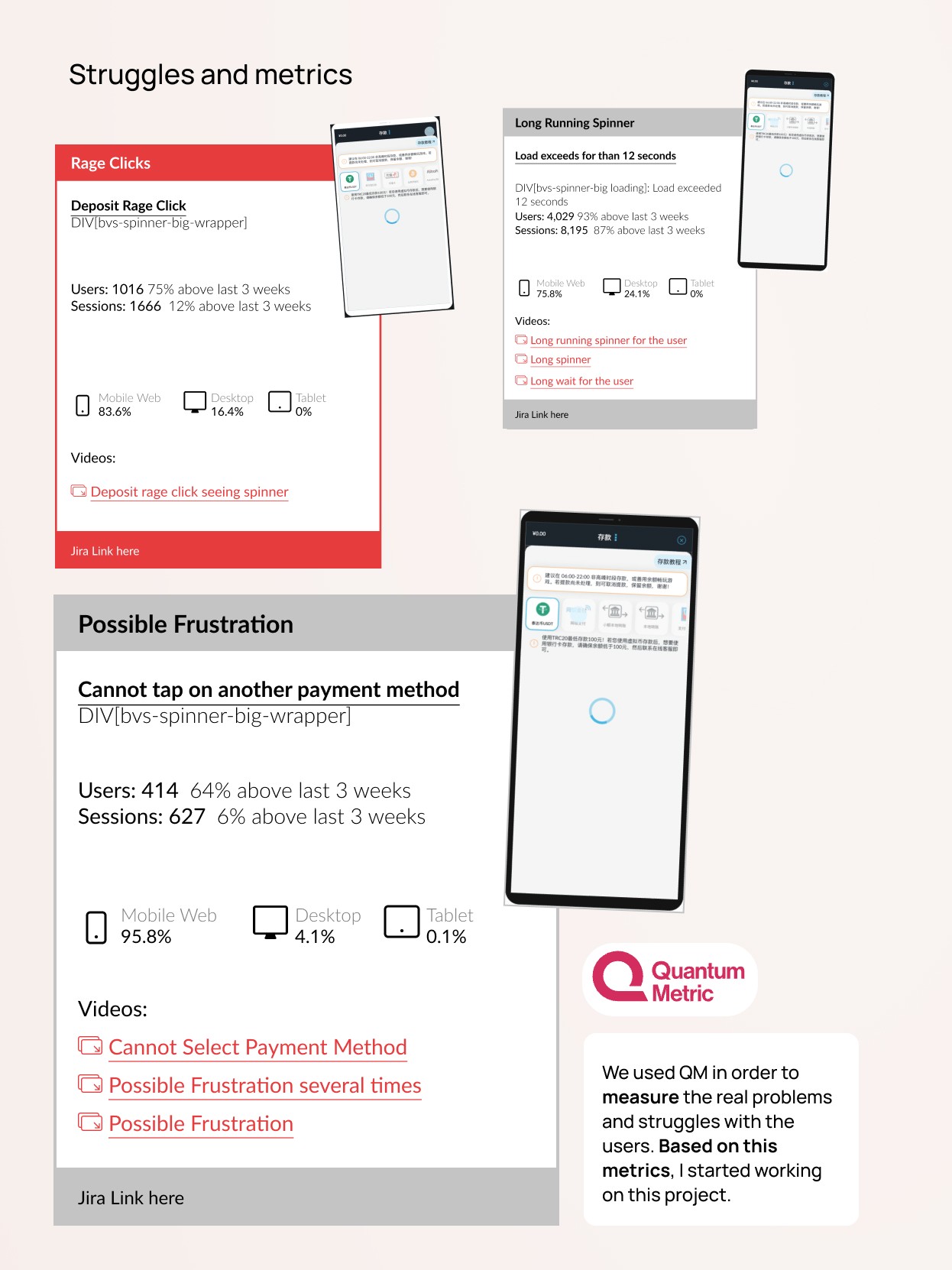
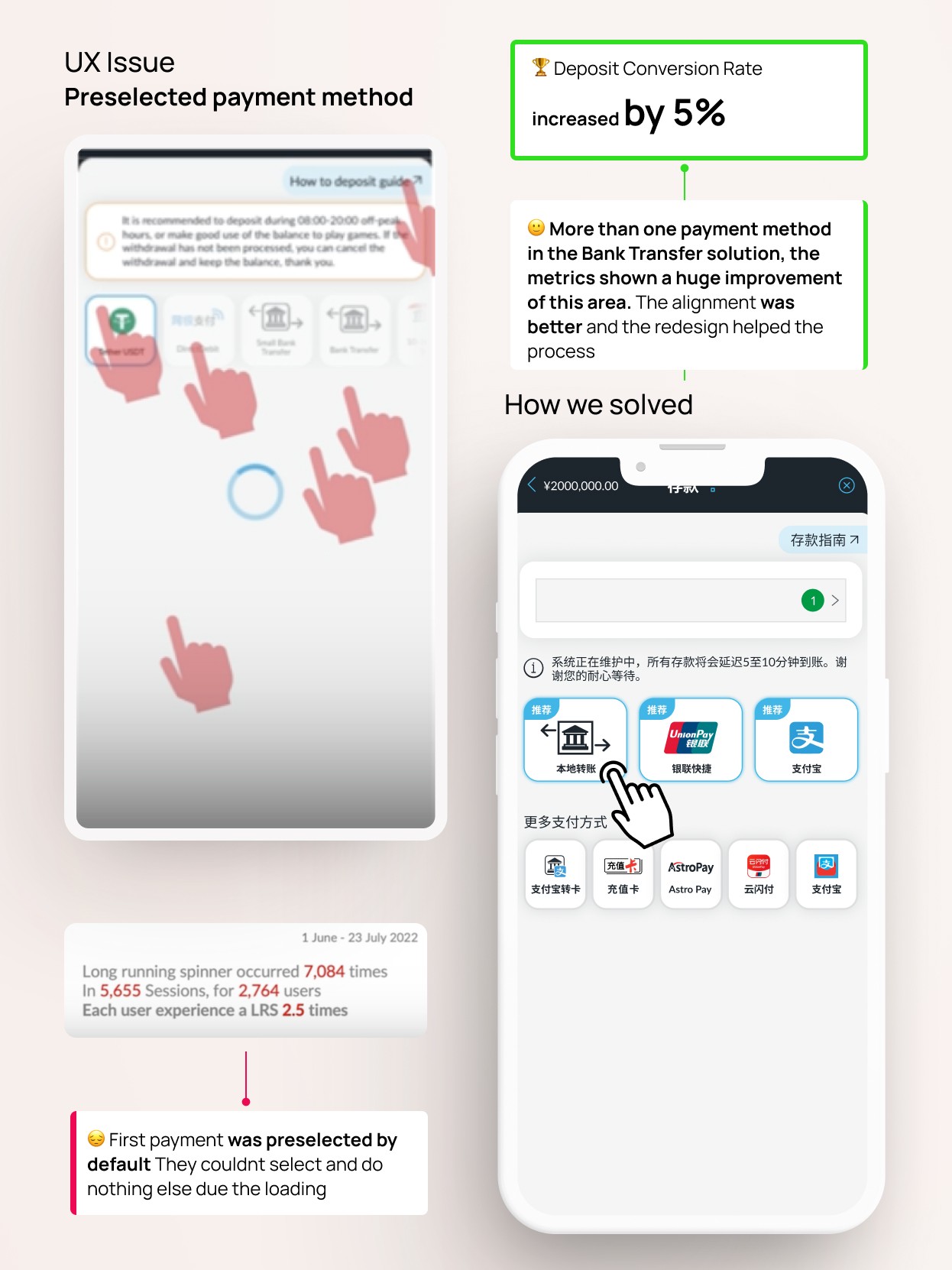
We saw lots of problems when people paid uaing Asia Cashier payment methods. We looked at what users were struggling with using a tool called Quantum Metric.
They were clicking angrily and waiting too long for things to load, that caused a lot of frustration.
After looking deep and understanding Asian culture better, we knew we had to change how payment options were shown. We wanted to speed up the time it takes to load and skip a step that automatically selects an option and it didnt work.
This wasn't just about one brand – it affected other Asian companies too. So, we made sure everything looked the same on different devices and brands.
My challenge was make the paying journey smooth without messing up the heuristic principles.
How I did it
This project was based on data, and it was one of the projects where metrics were relevant to show the improvements and the importance of the redesign.
❍ Data, the base
QM is a useful tool when complemented by insights from Confluence, Heat Maps, and some extra data provided. This collaborative approach enabled me to pinpoint and understand the primary challenges encountered along this journey.
❍❍ Alignment with devs and product owners
Four brands were deeply involved in these changes. I held ongoing workshops and meetings with developers, product owners, and stakeholders to align them on potential solutions.
❍❍❍ UI stage
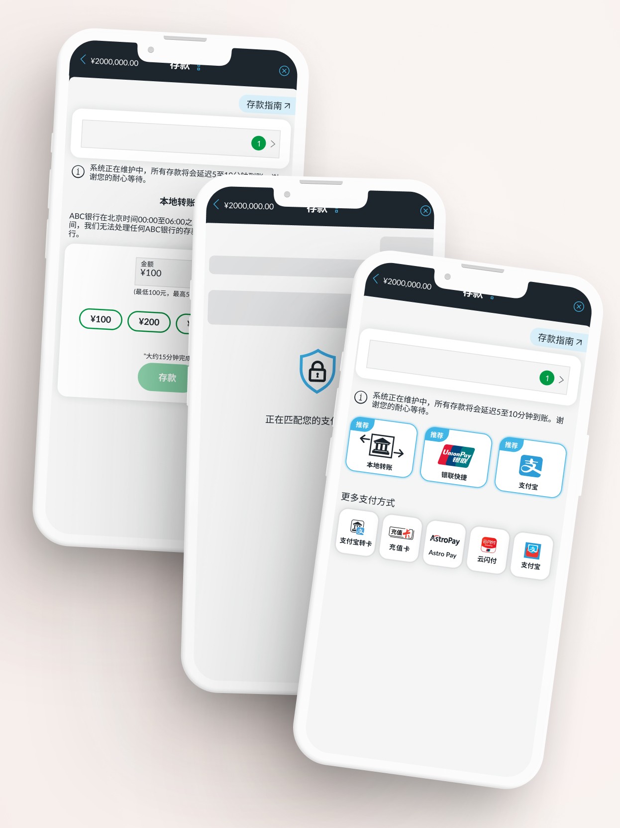
With a good understanding of the situation, I designed the first wireframes for improving payment methods and adding engaging user animations during page loading.
After the wireframes, I worked on the UI to address and solve user concerns.
I made choosing recommended methods engaging, allowing users to skip the loading spinner.
This solution was applied across all four Asian Brands, and our animation notably reduced major user frustrations.
Success and Results, and the Impact
After the main research, we decided to focus the solutions in 4 areas:
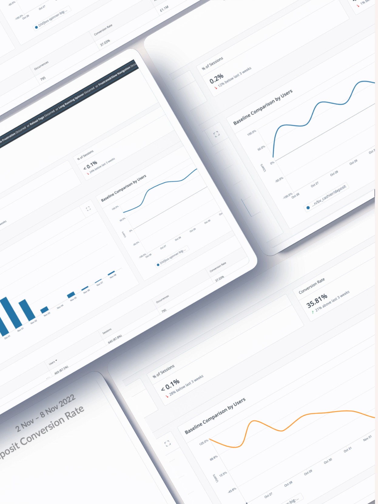
Long loading and a preselected payment caused a lot of frustration. 🏆 We improved the conversion rate by 5% after the redesign
Reduced Ragle clicks. 🏆 We reduced the rage clicks by 81% after the redesign
Reduced Frustrations 🏆 Possible frustrations were reduced by 79% after the redesign
The data results affirm the success of this project. We managed to decrease certain pain points by over 67%, as indicated by the heatmaps highlighting an easier payment process.
Overall, this area underwent substantial improvement, offering users a notably smoother journey.
The cool things 😎 and the bad things 🥹:
In my case studies, I enjoy sharing what I learned, what worked well, and what could have been better."
I really enjoyed working on this payment project, which is always a challenging area. Despite some limitations along the way, creating a smooth animation and a clean design helped prove the project's success.
This achievement was a great solution to our situation. By comparing the data, we gained a better understanding of the Asian market's needs.
A conceptual project using for an ecologic pop up market in a little kitesurf town in Spain.
